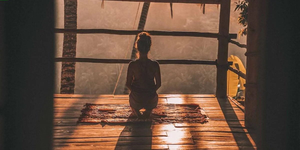
Meditation Colors: A Visual Journey into Tranquility
Diving into the world of meditation offers an array of benefits, one such element being “meditation colors”. These are more than just a palette to please your aesthetic sense; they’re actually profound tools that can stimulate specific emotional responses and deepen your meditative practices. Understanding these hues and incorporating them in mindfulness sessions could pave the way for enhanced peace and tranquillity.
Exploring meditation colors is like embarking on a visual journey where each color contributes uniquely. From calming blues fostering serenity, to vibrant reds sparking vitality — every shade has its own story to tell within your mental cosmos. As we dissect this rainbow spectrum further, you may unlock novel pathways towards tranquility right from the comfort of your mat or cushion.
Did you know?
“Meditation colors”, predominantly seen during mindfulness practices, are not random. In fact, these hues connect to specific chakras or energy centers in our body. For example, seeing purple often relates to the Crown Chakra that governs spiritual connection and enlightenment.
Understanding Meditation Colors and Their Significance
The significance of understanding meditation colors lies in their utilization as a tool to shape our mental and emotional state. Meditation, an ancient practice that emphasizes mindfulness and focused attention, has been enriched over the centuries with various techniques; among them is color visualization. In its essence, this method entails visualizing specific colors during your sessions which are believed to invoke certain emotions or states of mind.
Each hue holds unique symbolic meaning and energy vibration within the spectrum of light. For example, blue is often linked with tranquility and peace and could be utilized during meditation for calming purposes while red signifies passion or intensity perhaps used when seeking motivation. Expanding your knowledge on each shade’s representation aids in directing your focus towards particular goals you wish to achieve through meditation.
Importantly though – it’s not at all about strict rules but more so an exploration where individual experiences can differ vastly based on personal perceptions toward different shades- always remember there isn’t one size fits all approach here.Instead,varied interpretations provide room for incorporating bespoke solutions into own daily routines – creating deeper connections between self-awareness trials via mindful thinking hence achieving wellness aims holistically.
The Psychology Behind Color Choices in Meditation Spaces
Color plays a vital role in setting the mood and tone of any space, including meditation zones. The psychology behind color choices for your personal retreat isn’t just based on aesthetics but is deeply rooted in how these hues can affect your mental state. Here’s an exploration into this fascinating aspect.
When you visualize various “meditation colors”, it’s likely that each brings about a different sensation or feeling within you – which is not merely coincidental! Each hue carries its own energy frequency and psychological effects tied to our cognitive processes.
Blue, often associated with tranquility and peace, may bring serenity to mind during deep meditative practice. It forms the perfect backdrop for individuals looking to reduce stress levels or escape from their fast-paced lives momentarily.
Green represents growth, harmony, and freshness — ideal elements we seek through mindfulness exercises. Surrounding oneself with shades of green might potentially boost concentration powers aiding deeper immersion into contemplative states.
Yellow typically signifies warmth – invoking feelings similar to basking under soft sunlight rays early mornings; thus energizing yet calming at once!
Pinks could gently uplift moods promoting positive vibes while purple offer links connecting us spiritually igniting our intuition during mindful practices.
Don’t disregard neutrals such as whites representing purity & blacks symbolizing infinite potential either — both are powerful players when designing sacred spaces encouraging self-discovery journey towards inner peace via meditation discipline pursued sincerely throughout 2023!
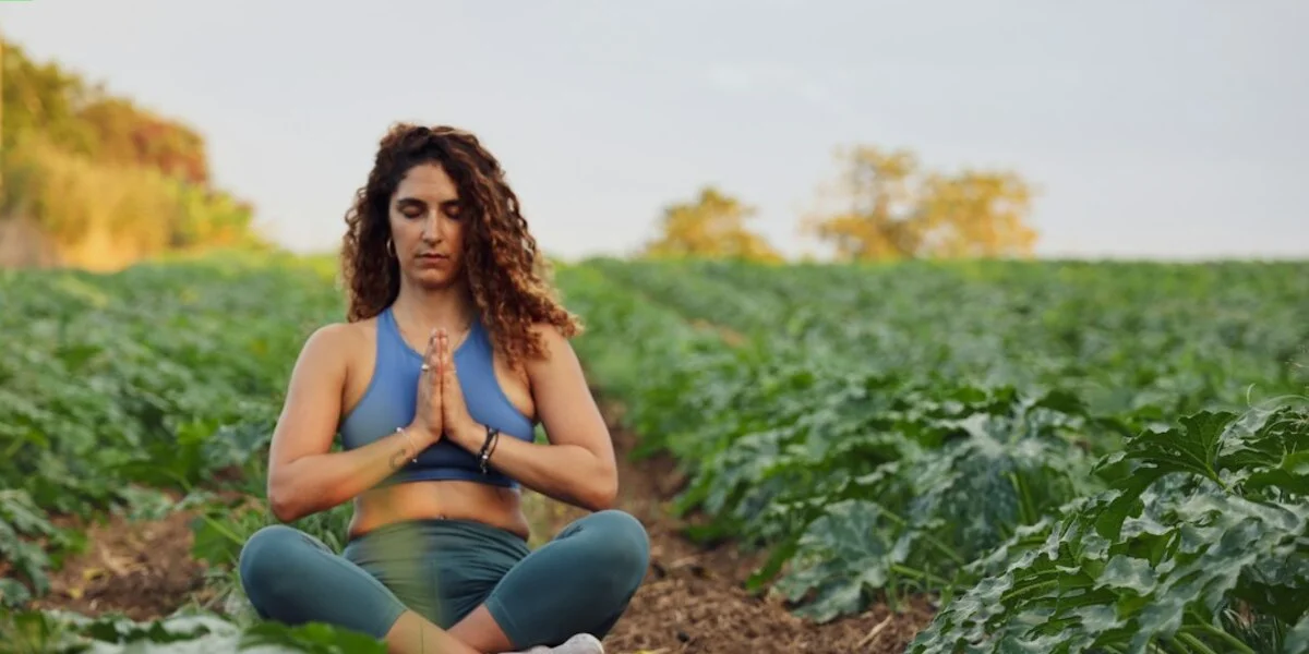
How Different Colors Enhance Your Meditation Experience
As a mindfulness practitioner, you might have already experienced the profound impact colors can have during meditation. The concept of “meditation colors” is an age-old tradition that revolves around color therapy.
Different hues and shades resonate with our energy centers, known as chakras, in unique ways. By focusing on specific meditation colors, we can align ourselves better with our intentions for each session.
Consider red: it’s often associated with grounding and stability because it resonates deeply with the root or base chakra—the first out of seven primary chakras according to Hindu tantrism. Immersing oneself in this potent hue during mediation could help establish feelings of security and connectedness.
Yellow – brimming full of vitality- aligns itself perfectly against your solar plexus – acting like sunlight strengthening life-giving plants! Your personal power will expand under its influence throughout quiet reflection sessions where yellow reigns supreme!
Green signifies healing; aligned directly towards heart center (chakra), meditations immersed green foster unconditional love self-forgiveness-foundational benefits being mindful!
Incorporating Color into Mindfulness Practices
Incorporating color into mindfulness practices opens a new spectrum of possibilities for enhancing your meditation experience. The influence that different hues can have on our mood and emotional state is profound, offering an often overlooked tool in the journey towards greater self-awareness and tranquility.
Colors, like words or music, communicate specific feelings and energies to us. Incorporating them strategically into our meditation sessions allows us to tap into these vibrational frequencies. For instance, blues are known to promote calmness and stability – making them ideal for stress-reduction meditations — while greens invoke feelings of growth and renewal perfect during transformative sessions.
To effectively incorporate colors in ‘meditation’, evaluate what you aim at achieving from the particular session—whether it’s peace, harmony or creativity—and leverage relevant hues either through visual cues around your practice space or imagination during closed-eye exercises. Using this mindful approach with colors adds another layer to engage with within ourselves deepening the overall meditation process extending beyond just silence but becoming 2023’s vibrant ‘colorful silence’.
Strategies for Integrating Visual Elements in Meditation
The integration of visual elements, especially meditation colors, into mindfulness practices can greatly enhance the overall experience. Here are some effective strategies one might consider.
Firstly, it’s essential to create a dedicated space for daily mindful exercises. This could be an entire room or a simple corner within your home. Designing this area with calming and soothing hues like soft blues or gentle greens may foster more tranquility during meditative sessions.
Another strategy is using color visualization techniques directly in your meditation routine itself. Close your eyes and visualize specific colors that represent certain emotions or energies you wish to attract—red for passion, blue for peace-keeping focus on the mental image as long as possible evokes these feelings effectively.
One mustn’t forget about wearable items such as clothing and accessories when contemplating adding meditation colors into their practice. Donning garments in shades reflecting moods can psychologically condition yourself before actual mediation begins.
Selecting the Right Palette for Personalized Mindfulness Sessions
When it comes to mindfulness and meditation, personalization has a significant role. Each person reacts differently to different stimuli; hence, tailoring your sessions based on individual preferences can boost the effectiveness of these practices. One such aspect that is ripe for customization is adding ‘meditation colors’ into your routine.
Colors carry vibrations which interact uniquely with each individual’s energy patterns. This means certain hues may inspire relaxation in one person while stimulating concentration or creativity in another. Harnessing this power by selecting an appropriate palette for personalized mindfulness sessions could optimize their benefits.
Firstly, understand what each color signifies:
– Red – Grounds us and enhances our sense of security.
– Orange – Stimulates emotional expression and pleasure.
It’s important to note that these are general attributes associated with the colors – you might resonate differently depending upon various factors like culture or personal experiences.
To begin incorporating meditation colors into your practice successfully in 2023 – start observing how specific shades make you feel throughout the day. Do bright yellows fill you with joy? Does blue evoke calmness efficiently?
Next step would be adapting these observations into practice: Create visual cues around your dedicated meditative space using items—cushions/candles/art—in chosen tones as per mood desired during session—for instance calming blues for evening unwinding meditations or energizing oranges decompression post-workout mindful moments!
Optimizing Your Environment with Meditation Colors
The colors we surround ourselves with influence our emotions and behaviors on a subconscious level. When it comes to mindfulness practices like meditation, the hues in your environment can markedly enhance or hinder your ability to focus, relax, and delve into self-introspection. Harnessing the power of specific “meditation colors” is becoming an increasingly popular method among those who seek optimum tranquility during their sessions.
Meditation doesn’t just entail closing one’s eyes; it’s about wholeheartedly immersing oneself within an internal journey towards peace and clarity. The color scheme you associate with this spiritual sojourn should invoke quietude while gently nudging distracting thoughts away from your consciousness. For instance, blues often evoke a sense of calmness due to its association with serene landscapes such as skies and seas– making them ideal for creating that tranquil atmosphere desired during meditation.
Having said that, there isn’t a universal set of “best” meditative colors- each individual resonates differently based upon personal experiences or cultural frameworks they’ve been shaped by throughout life. Henceforth in 2023 – understanding these unique emotional color relationships enables us not only to design spaces better suited for peaceful introspection but also allows us greater control over tailoring personalized journeys through mindfulness practice.
Creating a Harmonious Space for Enhanced Focus and Clarity
Creating a harmonious space for enhanced focus and clarity is crucial in achieving successful meditation. One of the ways to optimize your environment involves the clever use of specific meditation colors. Here’s how you can incorporate these soothing hues into your existing décor and start reaping their calm-inducing benefits.
Firstly, consider blue – a color often associated with tranquillity, restfulness and peace. A soft shade on walls or cushions may be effective at inducing relaxation during mindfulness practices.
Another excellent choice is green; linked nature, health, and healing it’s ideal to help reduce anxiety levels. Adding potted plants or wall art featuring green landscapes could make significant strides in establishing an atmosphere conducive to mindful concentration.
Tailoring Color Use to Support Specific Meditative Goals
Incorporating certain meditation colors into your environment can greatly enhance your meditative practice. This is particularly beneficial if you’re aiming to achieve specific goals such as deep relaxation, increased focus, or emotional healing.
On the other hand, if your intent in meditating involves increasing concentration levels and amping up creativity, colors on the warmer spectrum such as reds and yellows can be strategically employed within our spaces. Red has been known for its stimulating qualities which bolster alertness while yellow incites intellectual activity by sparking one’s curiosity through its brightness.
Furthermore, there exists this middle ground between warm and cool tones – purple being at helm of it all due to its dualistic characteristic coming from combining fiery red’s excitement with placid blue’s peaceableness. It aids especially well in achieving balance—a much-needed element for mindfulness—while also encouraging spiritual growth.
Conclusion
In the realm of tranquility, meditation colors can truly be your magical brush. They have the power to shape our emotions and thoughts, guiding us gently towards inner peace. Embrace these sensory cues as part of your daily mindfulness regimen.
You’ll find a world inside you painted in radiant hues – each meditation session being an immersive journey into composure.
Explore deeper, there is much more to learn about Meditation and Mindfulness through our website’s rich trove of sources that range from beginner’s guides to advanced techniques! Practicing mindfulness not only enriches one’s spiritual life but also improves overall well-being marking profound impacts on everyday living. Our resources will help fine-tune your understanding like masterful strokes refining a beautiful artwork – Turn curiosity into knowledge starting today!